

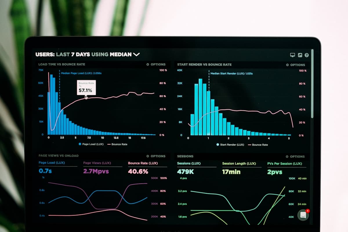
"Build a dashboard" is easy advice and a genuinely hard blank page. The useful question isn't whether you need a Shopify dashboard — it's which widgets actually belong on it, and for whom. Here are 15 concrete examples, grouped by the team that would actually use them.
Financial Dashboard Examples
1. Revenue vs. expenses trend — a rolling line chart comparing monthly revenue against ad spend and product cost, so a margin squeeze is visible before it shows up in a spreadsheet.
2. Net profit KPI card — a single standing number, calculated from real order data minus costs, with a 30-day period-over-period change badge.
3. Discounted orders table — every order with a discount applied, so finance can see exactly how much margin promotions are costing in real time.
4. Financial summary by channel — revenue broken out by sales channel, useful the moment a store sells on more than just its online storefront.
Marketing Dashboard Examples
5. Order volume and AOV trend — two KPI cards side by side, since a rising order count with a falling average order value tells a very different story than both rising together.
6. New customer count — tracked against a goal, so a marketing team can see acquisition performance without waiting for a monthly report.
7. Sales by channel chart — a bar chart comparing channels, useful for deciding where to shift budget next.
8. High-value orders table — flags big transactions so marketing knows which campaigns or channels are actually driving the best customers.
Inventory Dashboard Examples
9. Low stock products table — every product crossing a stock threshold, ideally paired with an automated alert rather than a manual check.
10. Out of stock products table — a dedicated view of what's currently unsellable, which is often a longer list than expected.
11. Product count by vendor — a simple chart that becomes useful the moment a store works with more than one supplier.
Product Dashboard Examples
12. All products table — full catalog view with price, stock, and vendor, filterable and sortable.
13. Best sellers chart — top products by revenue or units sold over a chosen period.
Customer / RFM Dashboard Examples
14. RFM segment distribution — a chart showing how many customers fall into Champions, Loyal, At Risk, Lost, and Hibernating, so you can see the shape of your customer base at a glance.
15. Customers at risk of churning table — a live list of customers whose Recency score has dropped, meant to be checked weekly rather than discovered by accident.
"We used to have one dashboard everyone shared, which meant it was full of things half the team didn't care about. Splitting it into a financial view and a marketing view took an afternoon and immediately made both more useful."
— Ecommerce Manager, Multi-Brand Shopify Store
Building These Without Starting From Scratch
You don't need to build all 15 from a blank canvas. SnapDash ships with four prebuilt dashboards — Products, Financial, Marketing, and Inventory — already populated with widgets close to several of the examples above, plus a drag-and-drop editor for adding the rest. KPI examples like net profit and new customer count can also be set up as tracked goals with automatic progress, rather than just a static number on a card.
The real lesson across all 15 examples: a dashboard is only useful if it's scoped to a specific team's actual questions. A shared, one-size-fits-all dashboard is usually a sign it's time to split it up. If you're setting one up for the first time, see our step-by-step guide to creating a Shopify dashboard.